Microsoft Surface Duo 2: A Bad Case for 2 Screens
Microsoft’s book-phone displays flashes of brilliance, but delivers endless annoyance….

It was also littered with bugs, as WIRED’s Julian Chokkattu found. (He also read Dune on the original Duo, which I hadn’t realized when I began reading the science fiction fan favorite on the Duo 2). These weren’t just a few flaws, some carry-on baggage you might find tolerable at the start of a new-phone relationship. This was deal-breaking stuff. Microsoft was determined, though, to make it better. To try, at least.
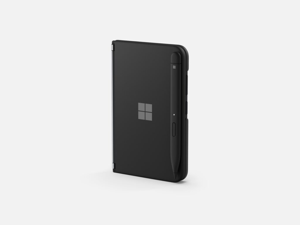
So the Duo 2 was built with a much snappier processor (Qualcomm’s Snapdragon 888) and a slightly thicker but more robust body than the last model. The new design sports a triple-lens camera module on the back—a 12-megapixel wide camera, a 16-megapixel ultrawide camera, and a 12-megapixel telephoto lens—a solid upgrade from the original Duo’s 11-megapixel camera, which doubled as both the selfie camera and the rear camera (once you flipped the device around). Like the previous Duo, the Duo 2 is eye-catching. Its front cover has a shiny Microsoft logo on it, coated in glass, which I’ve already scratched. The two 5.8-inch, high-resolution display panels have respectable 90-Hz refresh rates. Also, it works with Surface stylus pens, which start at around $65.
It exhibits flashes of brilliance, like a literal flash of a notification that appears on the spine of the device when it’s closed. Users of the first Duo, those brave beta testers, didn’t like that there wasn’t any way to see incoming notifications when the Duo was folded shut. So Microsoft built a “glance bar” on the spine, where you can see the phone’s charging status or an incoming call or text. This was oddly delightful. I asked WIRED’s new global editorial director to send me a text as he stood nearby so we could watch the Duo 2’s glance bar light up. I think I dug it more than he did.
The camera is decent, but for a $1,500 phone, it underperformed. I carried Apple’s iPhone 13 ($799) and Google’s Pixel 6 ($599) with me as I tested the Duo 2 and was often underwhelmed by the Duo’s comparative lack of camera prowess. Photos of people in standard lighting settings looked dull. In a series of sunset photos taken on the beach, colors bled together and the edges of sand dunes were less crisp than in the same images captured on a new iPhone. When I snapped shots of colleagues in our office with the Duo 2, office light rays dispersed behind them.
Maybe more notable, just taking photos is a painstaking process, as it involves opening up the booklet first. Capturing a screenshot requires pressing the power button and volume down button simultaneously—also awkward. On the upside, when you take a selfie, you can easily prop the phone up and time a photo, no phone stand required.


