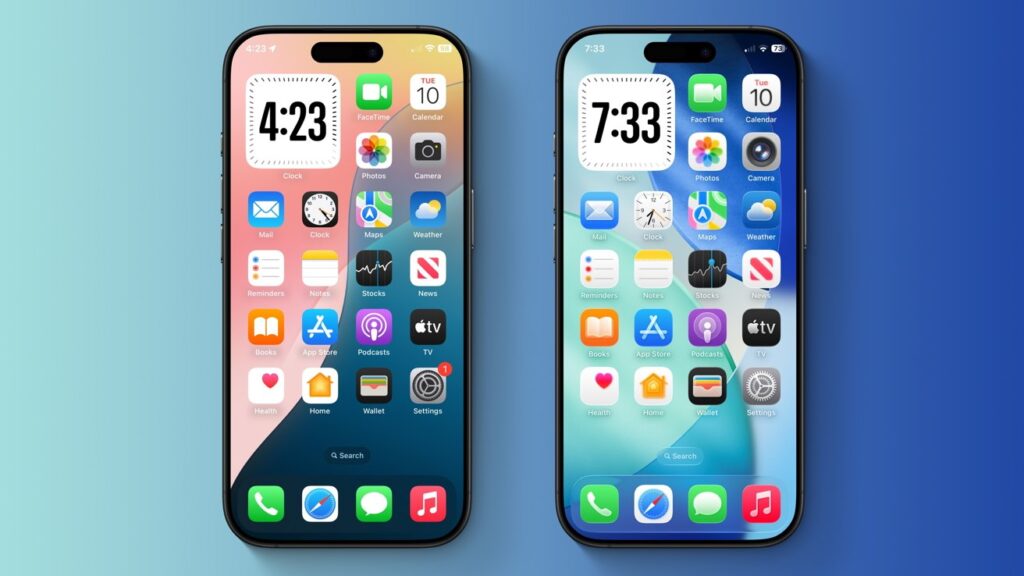

With iOS 26, Apple unveiled a unified design language with translucent elements that mimic the look of real-world glass. Here’s how it compares to iOS 18.
iOS 26 vs iOS 18: iOS 26 (right) features slightly larger icons compared to iOS 18 (left) — but they both use the same color palette.
On June 9, at its annual Worldwide Developers’ Conference, the iPhone maker finally unveiled the long-rumored visionOS-style redesign we were all waiting for. The company’s latest operating systems all received a revamped user interface with a new material dubbed ‘Liquid Glass.’
Apple says that Liquid Glass uses real-time rendering to imitate the way glass refracts light, and explains that the new material reacts to movement dynamically with specular highlights. It’s used across various user interface elements, including buttons, switches, app icons, the Lock Screen, Control Center, and more.
Continue Reading on AppleInsider | Discuss on our Forums


